


Contrasting colors in food photography

Food photography is a great way to showcase the beauty and appeal of different dishes. When it comes to creating visual interest, one effective technique is to combine foods with contrasting colors. Contrasting colors can create a dynamic and eye-catching composition that draws viewers’ attention. Here are some tips on how to incorporate contrasting colors in food photography:
Identify complementary colors: Complementary colors are hues that are opposite each other on the color wheel. For example, red and green, blue and orange, or yellow and purple are complementary pairs. By combining foods that exhibit these contrasting colors, you can create a visually striking composition.
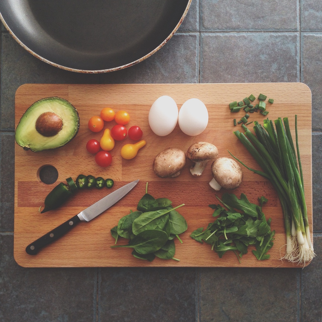
Use colorful ingredients: Look for ingredients with vibrant and contrasting colors. For instance, you could pair bright red tomatoes with fresh green basil leaves or yellow bell peppers with purple eggplants. Experiment with different combinations to find what works best for your specific dish.
Consider the background and props: The background and props in your food photography can also contribute to the contrasting color scheme. Choose a background that complements and enhances the colors of your dish. Additionally, select props that add pops of contrasting colors, such as colorful tablecloths, utensils, or napkins.
Play with textures and shapes: Contrasting colors are not limited to just the primary hues. You can also create contrast by incorporating diverse textures and shapes in your composition. For example, pair a smooth and creamy white sauce with a vibrant red pasta, or a crunchy green salad with colorful diced fruits.
Pay attention to lighting: Lighting plays a crucial role in food photography. Make sure to use natural or artificial light sources that enhance the colors and create a pleasing contrast. Experiment with different lighting angles and intensities to achieve the desired effect.
Balance the composition: While contrasting colors can create visual interest, it’s essential to maintain balance in your composition. Avoid overwhelming the frame with too many contrasting elements. Instead, focus on creating a harmonious balance between the contrasting colors and other elements within the frame.
Color psychology: Consider the emotions and associations that different colors evoke. For example, red is often associated with energy and appetite, while blue can create a sense of calmness. Understanding color psychology can help you choose contrasting colors that align with the mood or message you want to convey through your food photography.
Color blocking: Arrange your ingredients or dishes in a way that creates distinct blocks of contrasting colors. This technique can be particularly effective when photographing a flat lay or overhead shot. Play around with different arrangements and patterns to find visually appealing compositions.
Color temperature: In addition to contrasting hues, you can also experiment with contrasting color temperatures. Warm colors like red, orange, and yellow can be balanced with cool colors like blue and green. This interplay of warm and cool tones can create an engaging visual contrast.
Minimalism: Sometimes, less is more. Embrace minimalism in your compositions by focusing on a single pair of contrasting colors. This approach allows the colors to take center stage and creates a clean and impactful image.
Editing techniques: Post-processing plays a vital role in enhancing the colors and contrast in your food photographs. Use editing software to adjust the saturation, vibrancy, and contrast of your images. However, be mindful not to overdo it—maintain a natural and appealing look.
Consider color harmonies: While contrasting colors can be attention-grabbing, you can also explore different color harmonies to create visually pleasing compositions. Analogous colors, which are adjacent on the color wheel, can provide a sense of harmony and cohesion in your photographs.
Background and props: Besides the colors of the food itself, pay attention to the colors of the background and props you use. The background and supporting elements can either complement or contrast with the colors of the food. Experiment with different combinations to find the most visually appealing arrangements.
Storytelling: Use contrasting colors to enhance the narrative or story you want to tell through your food photography. For example, you can use contrasting colors to represent contrasting flavors, ingredients, or cultural influences.
Depth of Field: Play with the depth of field to create different effects. A shallow depth of field (achieved with a wide aperture, such as f/2.8) can create a dreamy, blurred background, drawing attention to the main subject. Alternatively, a deeper depth of field (achieved with a smaller aperture, such as f/8 or f/11) can keep the entire dish in focus, which is particularly useful when showcasing intricate details or a layered dish.
Styling and Arrangement: Pay attention to the presentation and arrangement of the food. Ensure that the dish is visually appealing by arranging the ingredients neatly, highlighting textures, and balancing colors. Use fresh herbs, sauces, or edible flowers to add pops of color and freshness. Experiment with different plating techniques and consider the overall shape and form of the dish to create an appealing visual flow.